Hello again!
If you find this project to be different from the last time you checked it, you are right. Your eyes are not fooling you.
This self-originated logo redesign exercise was published back in December of 2017, and after I contacted some people at ILGA via Twitter, a conversation was sparked within the organization about the need to have a more consistent visual identity. This topic gave origin to a call for bids where designers around the globe proposed their ideas. Of course, I wanted to participate with my project, too!
Two months went by and I received this:
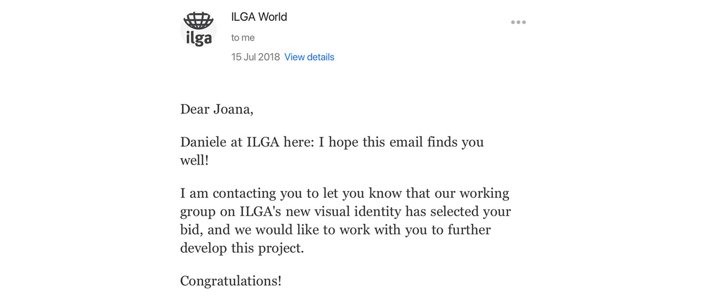
Hooray!!!
Some changes were necessary to be made to the original work and some aspects that I didn’t initially take into consideration now needed to be thought out. Me, Daniele Paletta at ILGA and a working group that was selected to accompany the project closely put our minds together and ended up with a solution that made the most sense to the organization in its fullness.
You can still check the original work in the following video, but if you are curious about the new result, let's keep scrolling!
About ILGA
ILGA, or the International Lesbian, Gay, Bisexual, Trans and Intersex Association, is a worldwide organization that fights and advocates for the attainment of equal rights for all sexual, gender and sex minorities.
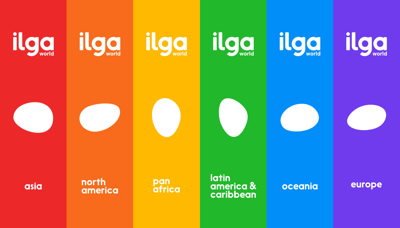
The organization was founded in 1978, in England, with 30 men from 11 organizations located in 10 different countries. Today, the organization has more than 1500 member organizations in 152 countries and territories from all regions of the world: Africa, Asia, Europe, Latin America and Caribbean, North America and Oceania.
ILGA was involved in getting the World Health Organization to stop considering homosexuality as an illness, it was the first NGO working on LGBTI issues to achieve consultative status at the United Nations, and it fights daily for the equality and liberation of LGBTI people from all kinds of discrimination.
Their work is vast, critical and far-reaching. And although the world is getting better, there are still 70 countries where consensual same-sex activity is considered to be a crime. Six of those with punishment by death penalty and 33 by a prison sentence from 8 years to life. There is still discrimination, verbal and physical abuse at schools, workplaces, in faith, local communities and all kinds of legal barriers that pushes the LGBTI community to the far end of society.
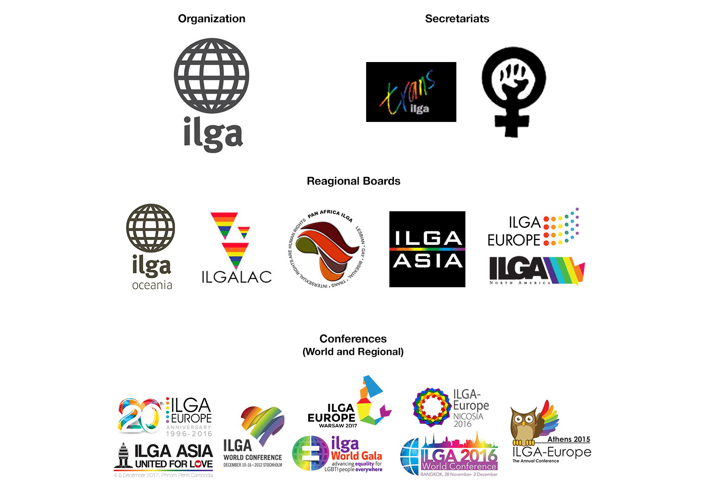
The many logos
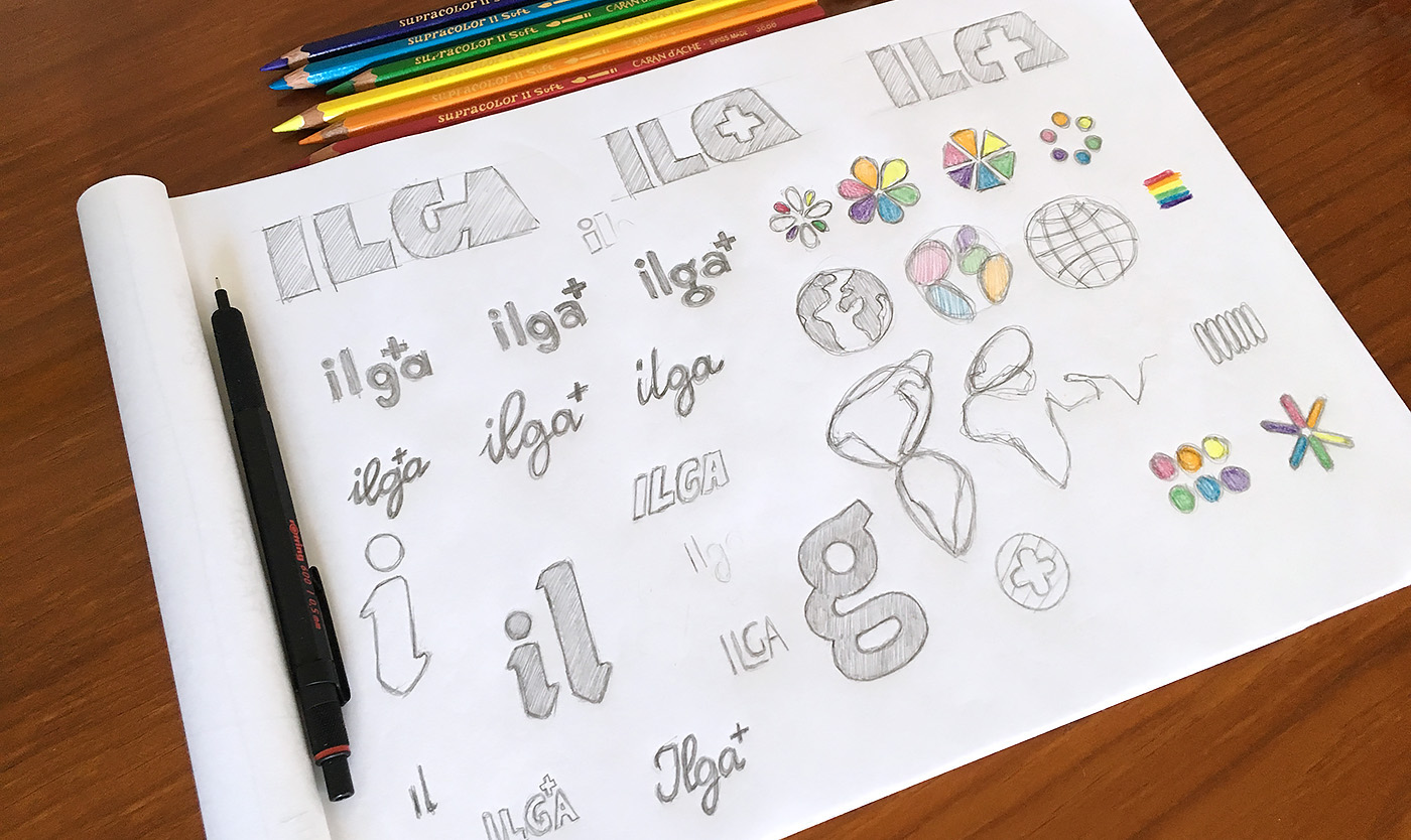
I know of ILGA for quite some time, and only after I decided that I would be doing something for them, that I fully understood how big, well established and decisive this organization really is. Trying to analyze the motifs behind my miss-information, I realized that the organization is under-branded.
ILGA has a logo but had no guidelines nor a defined brand architecture in order to achieve brand consistency. Each regional section had their own logo, with none or very little connection to the organization’s logo, and each organization event had its own visual presence, completely distinct from each other. A selection of all these visuals is available in the image above.
This vast number of inconsistent logos and visual languages was actually making a disservice to the organization by diluting its presence and the way that it was perceived globally.
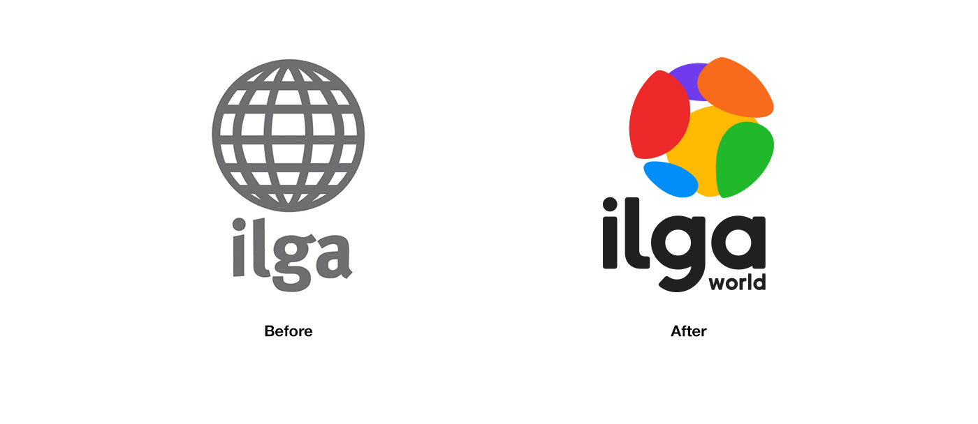
The concept
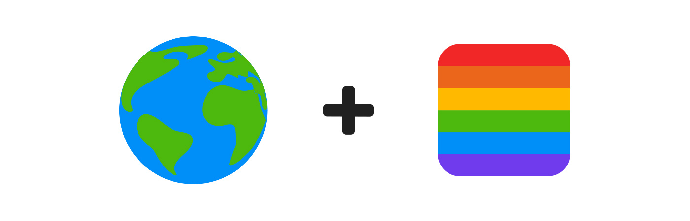
The main mission was to make noticeable how big this organization really is so, the first element that I had in mind was our planet Earth since the organization is globally present and the previous logo was based on that element.
Looking back at the existing logos, the only elements connecting almost every logo, are the rainbow colors: red, orange, yellow, green, blue and purple. The rainbow flag, or the LGBTI Pride flag, is a powerful symbol filled with hope, joy, and pride. It represents the fight for equality and, when used together, any LGBTI person will immediately recognize them.
Fortunately for me, ILGA is present is 6 regions of the globe and the rainbow flag has 6 colors. Just like that, I could connect these two elements.
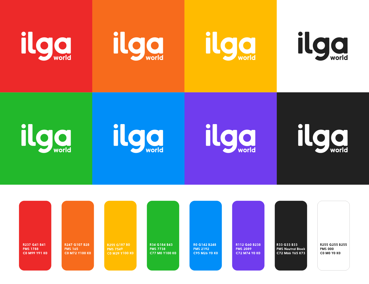
Picking colors
Having 6 colors in our hands was bound to generate some colorful work. What I didn’t predict was the challenge that that would also prove itself to be.
Here are the points of consideration that we needed to keep in mind when distributing the colors by all regional sections:
- We couldn’t use yellow on Asia because we don’t want to unintentionally make a racist remark;
- Using purple on Europe was a must since that region was already using it extensively;
- We couldn’t use red or blue on North America because we didn’t want to create any idea of affiliation with Republican or Democratic parties in the USA;
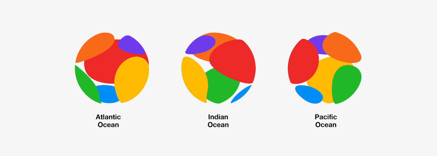
- Eventually, we also decided that the color green should be given to Latin America and the Caribbean to show solidarity with Argentina’s Green Wave and like-minded movements, as blue was associated with Oceania in an attempt to raise awareness of climate change and how it impacts our communities;
- At last, we also wanted to somehow provide a visual balance between all colors.
Having all of this in mind, this was the best and more harmonious result that we arrived to:
Where is the Antarctic?
I’m glad you asked. ILGA's work is fully human-oriented and their presence in the world depends on the presence of people. Although the Antarctic is a continent, it doesn't have any permanent human inhabitant, which means no humans to represent, protect or fight for. As a result, I represented a globe that is human and ILGA presence-oriented.
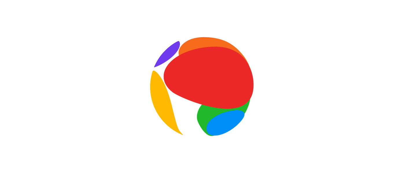
Centering the globe
Centering the globe the right way was a big concern for us. We didn't want to be insensitive to one's location and, at the same time, we didn’t want to provide more than one version of the icon. Since thousands of people around the globe will eventually work with the brand assets, that solution could eventually reveal itself to be a recipe for disaster.
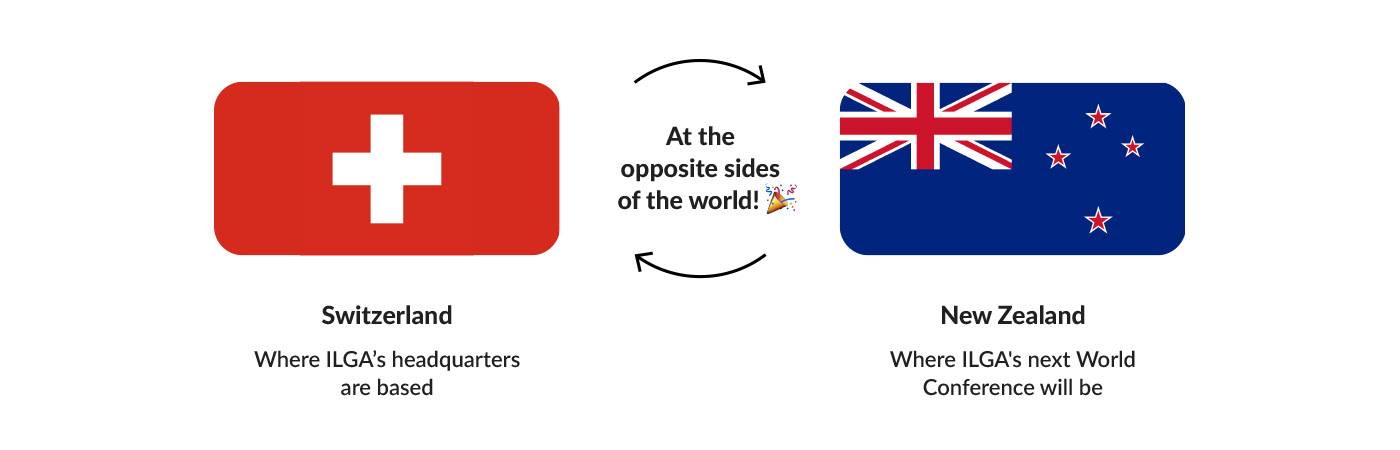
An idea that was then brought to me, was the possibility to center the globe on the Pacific Ocean. That would make sense to ILGA, as its new brand identity will be formally launched in the run-up to the 2019 World Conference that will take place in New Zealand - literally on the other side of the world from where ILGA started in 1978, showing how global is our community. That would be an important statement of globality, inclusivity and it was a coincidence that seemed too good to be true, so I made my best to make it work!
About representation
Representation is a way of acknowledging someone's existence. Is taking someone that is miss-or-not-at-all-represented and shining a light upon their presence as it is. Representation is a powerful thing that many take for granted because they had it, in the most various ways, their whole lives. It's having something to relate to, the recognition of the possibility of existence and the possibility of becoming. Assuring it to sexual, gender and sex minorities communities is part of ILGA's work, and also mine.
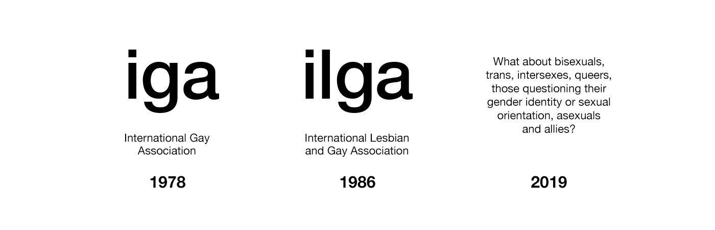
ILGA's name has changed over the years. It started by being IGA, International Gay Association. It was founded by men only and, for that reason, a decision was made not to include the word “lesbian” in the name of the organization until women were involved. Eight years later, in 1986, lesbians were included and the name was changed to ILGA.
Nowadays, the name ILGA still exists, but on the organization's website, we can read "International Lesbian, Gay, Bisexual, Trans and Intersex Association" as a subtitle for the organization's name. The big question was: how to make sure that the visual identity reflects the organization's global concern for all queer folk?
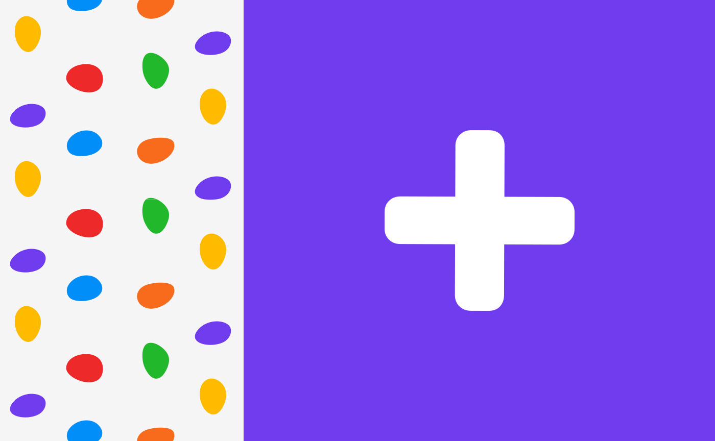
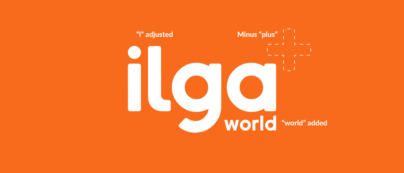
What about the “plus” sign?
The “plus” sign was part of the original solution that I created. Something that I saw as a possible solution, at the beginning of all, when I still haven’t had the opportunity to consult the people at ILGA about it. When we started working together, the “plus” sign was one of the first concerns to be raised, and when I saw why, it was a completely understandable concern.
The LGBTI community is quite complex, full of nuances and unlimited possibilities so, using the “plus” sign in an attempt to recognize other sexual orientations, identities and bodies beyond the two being represented on the original ILGA name, might be seen as “othering”. International Lesbian and Gay Association… and the OTHERS. See? It has the possibility to sound not so good.

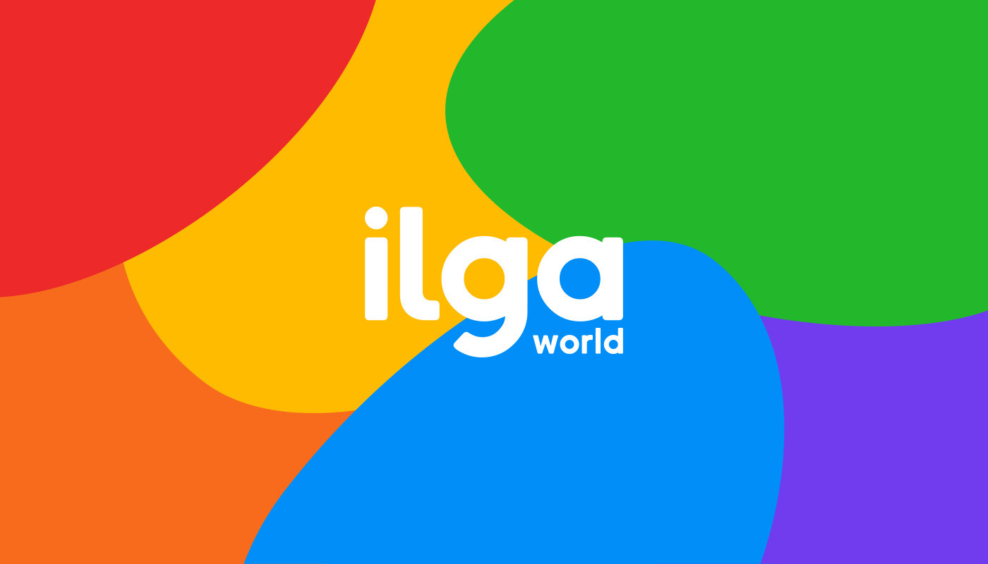
The most elegant and simple solution that would still preserve the organization's identity, was to include the “world” appendix. Making use of it doesn't change how we read the organization's name but it will show that ILGA acts globally, for queer people everywhere.
The letter L
A way to keep the ILGA wordmark in lower cases to imply a friendly tone and, at the same time, somehow be more inclusive (or at least more just), was to make the letter “l”, occupy more room in the wordmark. A way to generate a better balance between the “l” and the “g”, which in the original name stood for “lesbian” and “gay”, accordingly.
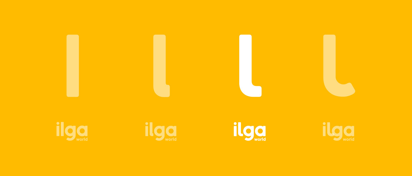
Initially, this seemed to be a strange request, but when I heard the concerns about possibly creating the idea of favoritism and considering that the only outcome to this change would be a better representation, there’s really no reason to think about it twice, so I did my best to make it work.

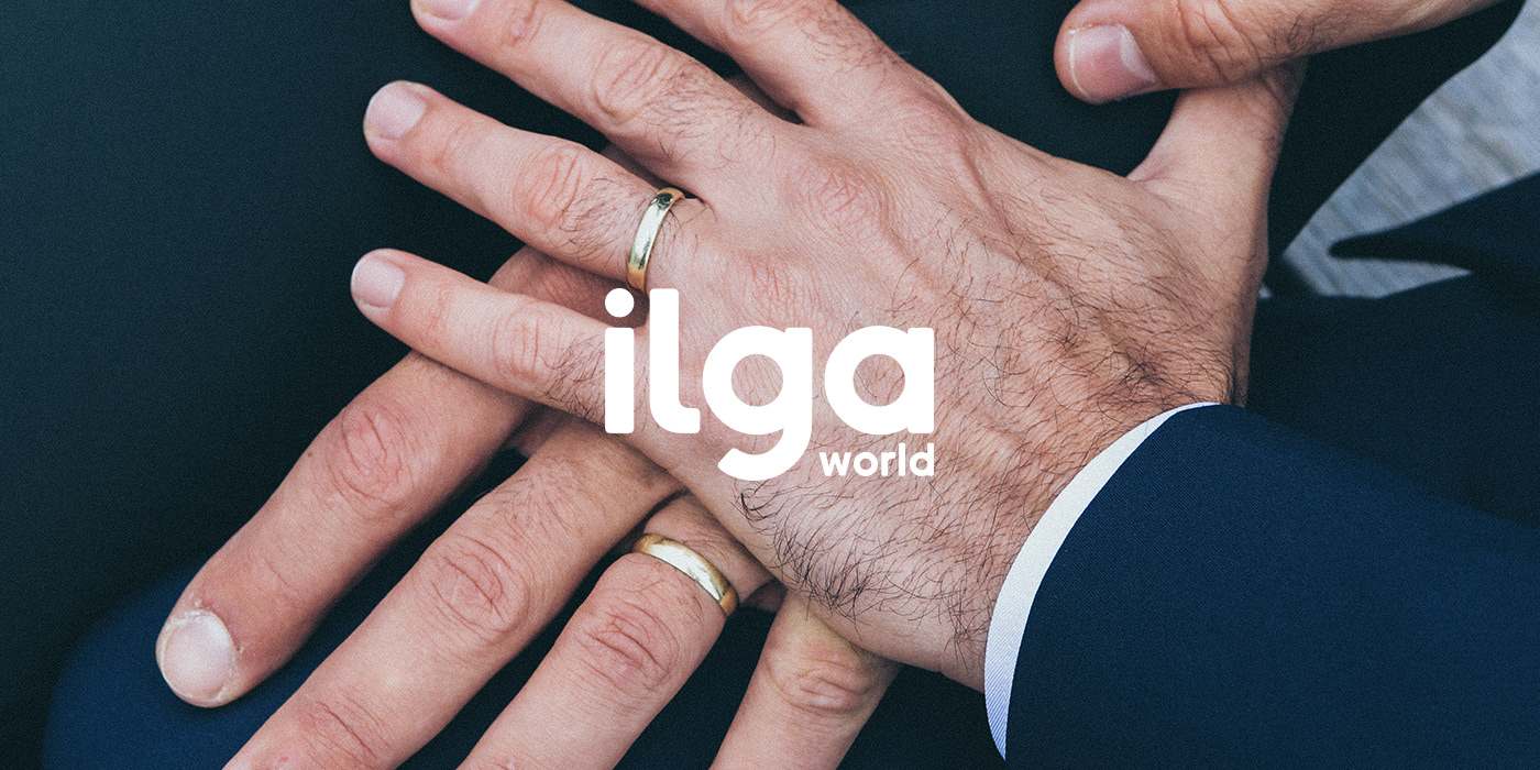
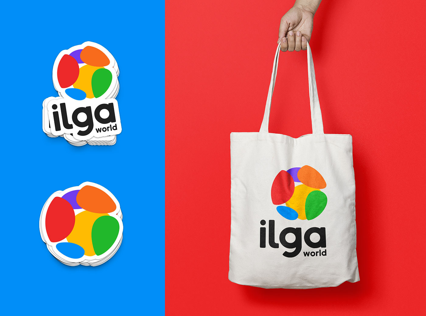
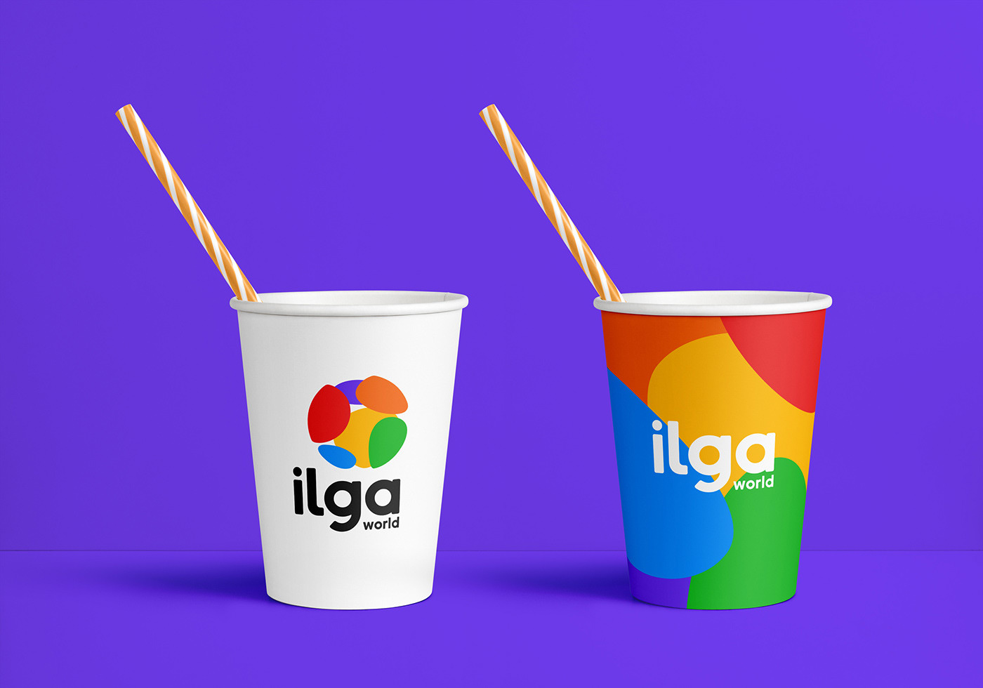
A multicolor logo
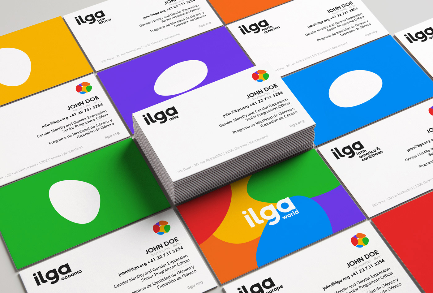
"Logos should be able to work in just one color." That's a basic rule in design that I'm challenging in this project. In this particular situation, I would say that there is power in the usage of colors. It gives us the chance to easily correlate ILGA World’s logo to the LGBTI community with just a glance, it can unleash infinite possibilities in the motion graphics department and it allowed me to create a logo system by splitting up the globe icon by regions and colors.
The colorful world icon can be seen as a pickle and generate some concerns, but there’s a simple way to overcome them. The icon can be removed and the wordmark, plus the appendix, can be used by themselves. We can either shy away from the colors, or we can use them in our favor.
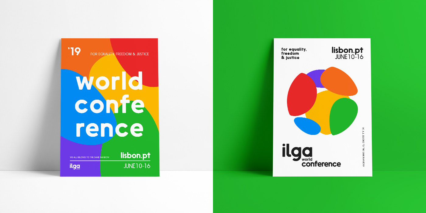
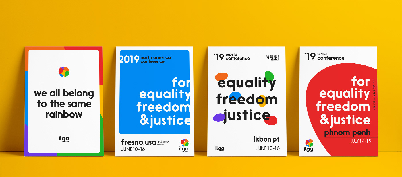
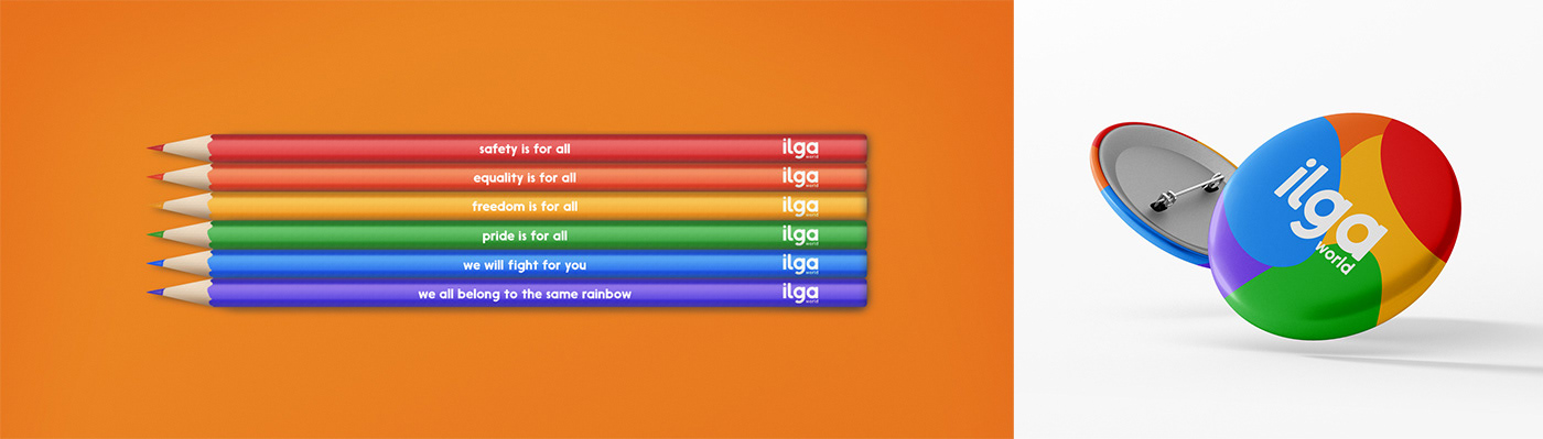
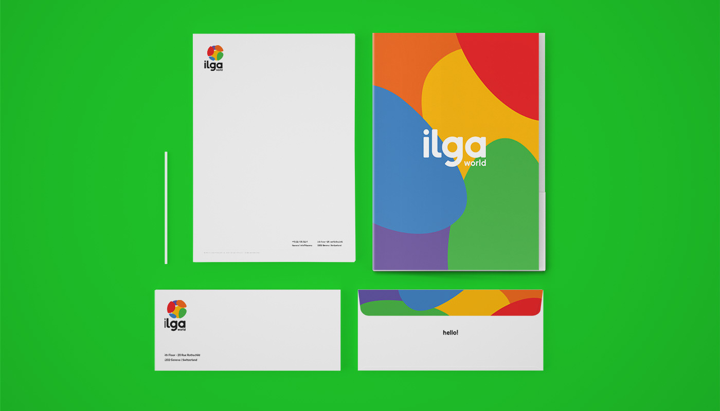
The visual language usage
Both above and below, we can see possible applications for the logo and visual brand identity. The rainbow color scheme could be used in world events like the Annual World Conference, galas or when the organization is being represented as a whole and not a regional section.
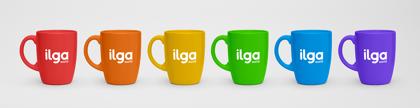
The new logo also offers the various ILGA regions the possibility to adopt a new logo on their own in case they want to, corresponding to the color associated to each of them in the ILGA World logo. It will be up to the regions to choose whether to adopt the new visual identity or keep using their current ones.

Ressources
Typeface used
Nanami by Alex Haigh
Mockups used
Photos used
People cheering (Ian Dooley) link - Hands with flower (Evan Kirby) link - Pride Flag (Yannis Papanastasopoulos) link - People dancing (Matthew Henry) link - Hands with rings (Nick Karvounis) link - When we hold hands (Tom Cochereau) link - I never said it (Cristian Newman) link - I just want to be (Seyfettin Dincturk) link - I don't talk about it (Teddy Kelley) link - I came out (Kobe Subramaniam) link - They found out (Shamim Nakhai) link